 Changing the location of totals
There are various ways to change the display of pivot tables:
Changing the location of totals
In general, totals are displayed at the bottom of a column or at the far right of a row. In some cases, it might be more practical to have the totals displayed at the beginning or at the end, however, because you are more interested in the totals than in the details, or because not all of the data fit into a single form. You can change their location by opening the Settings menu, selecting Location totals, and then selecting Column or Row. Select Far if you want the totals to be displayed at the end, or select Near if you want them displayed at the beginning.
It is possible to hide totals, for example if you are more interested in the details than in the totals. To display totals, open the Settings menu and then select the Show totals check box. Make sure to select only the totals you want to be displayed on the form.
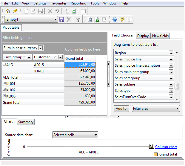
Data grouped in subcategories can be collapsed or expanded on the screen. For example, the part group 'DIV' can have different parts as subcategories. If you right-click the row or column fields, you can choose to collapse or expand these subcategories. You may do so for all rows or columns simultaneously.
Marking minimum and maximum values
Minimum and maximum values in pivot tables can be highlighted, so that they will immediate catch your eye. Maximum values are shown in blue, and minimum values are shown in red. You can choose to highlight the minimum and maximum values for a single row or column, or for all rows and columns. Specify your highlight choices in the Highlight maximum and minimum field on the Display tab of the pivot table.
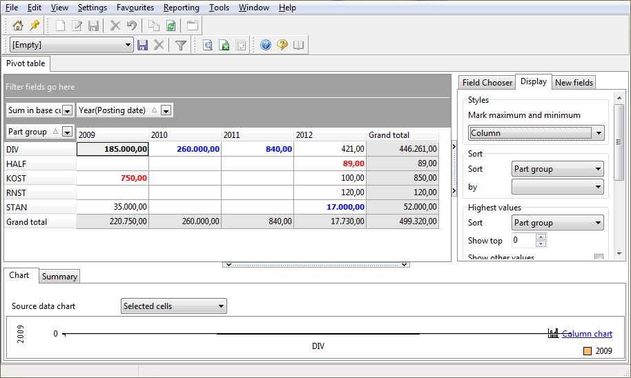
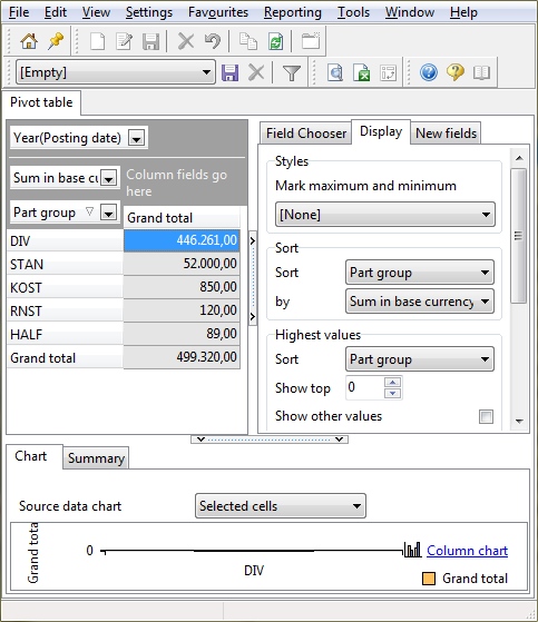
You can sort columns and rows. For example, you could sort part groups by turnover sum. As sorted values are easier to interpret, the sorting feature will help you to quickly draw conclusions from a pivot table. It helps you to answer questions such as: What has been the most profitable month? Who was the most successful salesperson in a particular period? What are the best-selling parts? The figure below clearly shows that part group 'DIV' generated the largest turnover. To sort data:
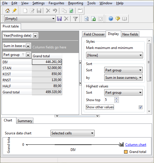
It is possible to display the highest values on the form, for example to give you a Top 5 of the best selling parts in a period. To do so, follow these steps:
Sorting pivot tables section).You can sort columns and rows. For example, you could sort part groups by turnover sum. As sorted values are easier to interpret, the sorting feature will help you to quickly draw conclusions from a pivot table. It helps you to answer questions such as: What has been the most profitable month? Who was the most successful salesperson in a particular period? What are the best-selling parts? The figure below clearly shows that part group 'DIV' generated the largest turnover. To sort data:
You can change the number format in the pivot table to increase the readability of the data, and thus simplify the interpretation of the data. You can select a format, manually enter a format, or use a combination of these methods.
Format |
Meaning |
#.###.## |
Thousands separator. For example: 1,500. |
0 / 0.0 / 0.00 |
The number of decimals to be used: 0=no decimals, as in '53'; 0.0=one decimal, as in '53.1'; 0.00=two decimals, as in '53.13'. |
€ / $ |
The currency symbol to be used. You can choose the position of the currency symbol. For example, specify '$ 0' for '$ 97', or '0 $' for '97 $'. |
Custom format |
In addition to the formats above, you can define your own formats, such as '#,###,##0 kilos' to display '5,764 kilos'. |
It is possible to change the field names in pivot tables, in order to make them more meaningful to you. This option may also be useful when the pivot table is based on report data, and you do not want to use the report column names. To change the names: