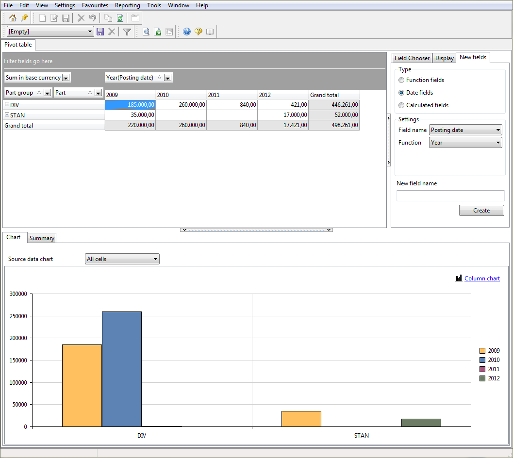
The pivot table data are displayed in graphic format at the bottom of the form. A graph is often easier to interpret than a set of numbers. At one glance, you will be able to see how the values relate to one another and identify any peaks and lows.
You can create a graph based on all data or on selected data. Make your selection in the Chart source data field. If you choose Selected cells, use the mouse to select the data you want from the pivot table. Only those data will be shown in the chart.
There are various types of charts you can use, including a bar chart and a pie chart. Click Column chart to view all options, and make your choice.
You may hide the chart, for instance to get a better view of the other data on the form. To hide the chart, click ![]() above the chart.
above the chart.